Uploaded by Havoc 


1280x800 JPG 147 kB 26 Views
Interested in advertising on Ponybooru? Click here for information!

Ponybooru ain't free mate - help support us financially!
ETH: 0xC41132ad4627FBfBd0d1712A27B268a06278eE50 | BTC: bc1qeyw3e72pcylque89r2940hhfzrz339kxuvruun
Description
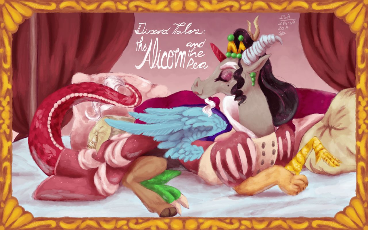
I decided to do a poster for every Pinkie tales I worked on, and the only one left was The alicorn and the pea, so there you have it. Soon enough I’ll start going back to other Pinkie tales (I have a sketch ready for Cindershy ;) )
This particular wip has been sitting on my wip album since June, and only yesterday I took the courage to finish it. I had the line art hood and flats nearly done, so I only had to put on the final flats and the cell shading before I started to render and to record.
I took a very different approach to the rendering here just like “Wild fire” (my Chrysalis illustration) though I think I executed it much better here.
I have a set of brushes that I use for almost everything and I rarely change them. For my Chrysalis drawing though, I needed a different brush to do the fire, and while browsing I found the brush I used for the rendering here. It is much different to the previous one (mostly the first one was square-ish the new one is round) but what made the most difference is that the new brush looks more organic, and I was naturally more inclined to not define the details too much, which I am VERY thankful for. The rendering part on this only took 2 hours and 25 minutes, as opposed to the 6 hours on the Slumber Jack poster, and considering Discord’s bird wing in the same blue as RD’s wing, I was getting flashbacks to the BORING time I spend rendering them, but here, though I still felt a bit bored, it was much faster, and much more satisfying to move on from. The rougher look also piles up because doing textures is incredibly more effective. You can see the tail, green leg and chicken arm are scaly, and doing that in the only style would have taken 1 hour alone.
So overall, I am incredibly proud of this piece, and I hope to improve more on this new work flow and style. Hopefully this change will be easily accepted by the public, but I myself am pleased with how it is going so far.
Comments
0 comments posted