Uploaded by Havoc 


1050x1016 JPG 537 kB 81 Views
Description
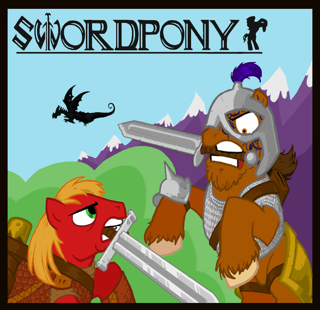
Swordpony Cover - Redux
Turns out, story covers look better when you put backgrounds and titles in them. And swords look better if they’re shiny.
Really wish I knew more about composition going into this. This image looks AWESOME when flipped horizontally, but some of the elements wouldn’t match up… so it has to stay as-is, with the good guy on the left.
Criticisms and pointers would be greatly appreciated.
January 4, 2012
Turns out, story covers look better when you put backgrounds and titles in them. And swords look better if they’re shiny.
Really wish I knew more about composition going into this. This image looks AWESOME when flipped horizontally, but some of the elements wouldn’t match up… so it has to stay as-is, with the good guy on the left.
Criticisms and pointers would be greatly appreciated.

January 4, 2012
Comments
0 comments posted