Uploaded by Sapphie 


1920x1361 PNG 3.76 MB 118 Views
Interested in advertising on Ponybooru? Click here for information!

Ponybooru ain't free mate - help support us financially!
ETH: 0xC41132ad4627FBfBd0d1712A27B268a06278eE50 | BTC: bc1qeyw3e72pcylque89r2940hhfzrz339kxuvruun
Description
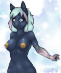
Finally got this coloured.
Wanted to get this done before trying out the DB collab thingy.
You might notice that I tried to stay close to the respective originals, such as…
…the conformation of the pony
…black vs dark coloured outlines
…solid vs gradient irides
I also fiddled around with different techniques.
Most parts of Twilight Sparkle have multiple layers of colour, up to seven that is.
While Twilight often has a single colour only, where lighter parts got filled by applying estompes (paper rolls).
I wonder if I should have drawn a background.
It would need to be subtle that doesn’t take the focus.
Maybe some faint blue and green colours hinting sky and land?
Or should I just leave it as is?
Do you have any suggestion?
Uncoloured version:
References:
Wanted to get this done before trying out the DB collab thingy.
You might notice that I tried to stay close to the respective originals, such as…
…the conformation of the pony
…black vs dark coloured outlines
…solid vs gradient irides
I also fiddled around with different techniques.
Most parts of Twilight Sparkle have multiple layers of colour, up to seven that is.
While Twilight often has a single colour only, where lighter parts got filled by applying estompes (paper rolls).
I wonder if I should have drawn a background.
It would need to be subtle that doesn’t take the focus.
Maybe some faint blue and green colours hinting sky and land?
Or should I just leave it as is?
Do you have any suggestion?
Uncoloured version:

References:

Source
not provided yet
Comments
0 comments posted